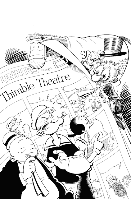
These were all drawn at about a quarter printed size - I like to make my initial drawings small because it forces me to think about the design and not get bogged down in rendering details too much, which is what I tend to do otherwise. Editor Craig Yoe favoured the one with Barney Google and Spark Plug peeking over the big newspaper comic page, and co-editors Ted Adams and Clizia Gussoni were both happy with that, so I then drew a more tightly-rendered version at a larger size - A4 in this case (or about 8.3" x 11.7" for the Americans in the audience).
Notice that I moved Popeye and Olive a bit closer to the centre and showed a bit more of Wimpy - these guys are the stars of the book, after all!
Then I scanned the pencils and blew them up to A3 size (11.7" x 16.5"), printed them out in light non-repro blue on fancy-pants art paper, and inked the printout with brush and dip pen.
Et voilà! I've already posted the finished, coloured version, so I'll spare you a repeat of that, but it's here if you missed it the first time around.


Great post! Just started working on my first amateur comic with a friend so this insight is very helpful! For a book like Popeye do you work the interior pages the same way? Do you create a set of thumbnails to make sure the story pace and length fit in the allotted page count? When you are not writer and artist, does it take many iterations to close with the artist?
ReplyDeleteThanks!
Wow, that's a lot of ground to cover! Briefly, normally I pencil fairly small, so my pencils are something between the thumbnails at the top and the finished pencils in the middle - enough to blow up, blue-line and ink over if there are no changes, but not so detailed and polished that I don't mind changing things if required. I don't think that's normal practice, but it works for me.
DeleteTo get the story into the allotted page count, I usually do a written page-by-page breakdown - this scene takes one page, this scene takes two, etc. - before I start a script. I put it down to a terrible sense of direction - I know people who can get from A to B without a map, but I'm not one of them. I don't recall ever doing thumbnails for another artist, but many have over the years, including many of the very best (Carl Barks did in the 70s, Kurtzman did, etc.) - whatever works best for your particular collaborative process. Unlike screenwriting, there's no one correct format for these things, which is just one of many reasons why COMICS ARE BETTER!
Roger thanks for the advice... My 2013 resolution is to commit faster and then figure things out instead of planning forever and getting no where with a project!!!! Got a plot done, estimated page count, book title/logo and cover rough done this week! Hopefully get first cut of thumbs this week. We are shooting for a 16 page ashcan!
ReplyDelete